Terrain Color Palette
The new Terrain Color Palette contains more than 1450 preset palettes for terrain texturing.
Colors have been sampled, using satellite imagery from locations around the world, to ensure the realistic shading of terrains.
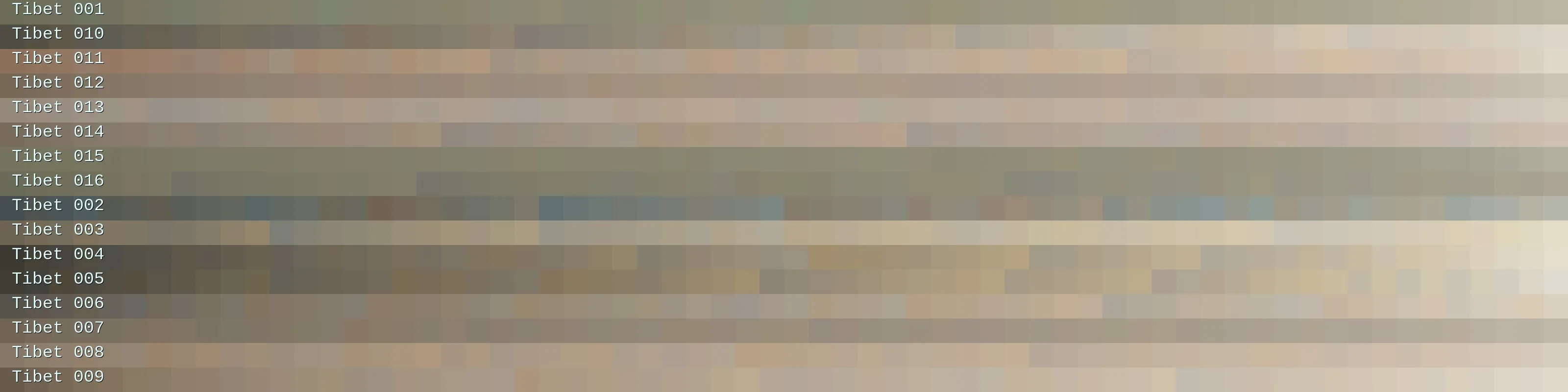
Some palettes from the ‘Tibet’ category.
Use the palette GUI element’s trim handles to define the palette range you want to be used and maximize the GUI element’s layout to reveal additional attributes.
To select another palette from the rich collection, simply click on the palette GUI element.
A preset selector window will pop up, allowing you to browse the available categories and select a palette that looks exactly as you want it.
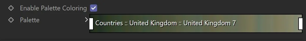
The Terrain Color Palette GUI element. The white boxes on the left and right sides are the trim handles.
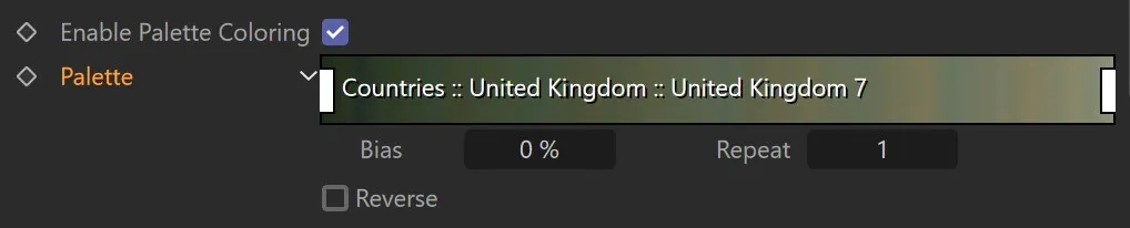
The GUI element with maximized layout. Below the palette, additional attributes are shown.
Properties
Section titled “Properties”Click & move the white rectangles at the palette’s sides to trim the area that colors are picked from.
Clicking on the arrow to the left of the palette to reveal three additional parameters.
Use the Bias control to offset the palette sampling positions to the left or the right, effectively resulting in a palette shift effect.
Repeat
Section titled “Repeat”Change the value to effectively set the palette’s scale, so you can stretch it out or have it repeat.
Reverse
Section titled “Reverse”Flips the palette.
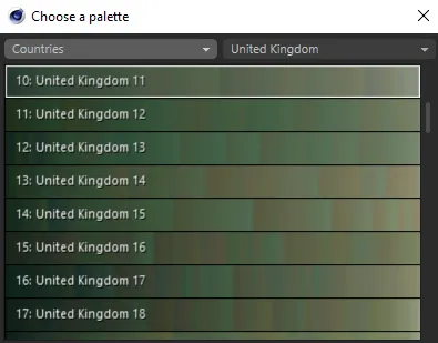
The Terrain Color Palette chooser.
Properties
Section titled “Properties”There are two separate categories within the palette: the main category, on the left, which allows you to select either Countries or Surfaces.
Within the Countries category, there is a subcategory, on the right, which allows you to select the country, presenting you with all available palettes from that subcategory.
Within the Surfaces category, clicking the subcategory will give you the option to choose from: Green, Lava, Rock, Sand, Snow or Water, presenting you with all available palettes from that subcategory.
The amount of available terrain color palettes can be overwhelming.
Some of them seem quite similar on first glance, others feature surprisingly flashy colors, or look almost unicolor.
Remember that you can heavily alter the results using the layer’s post processing operations.
For example, if a palette gives you a result that looks like it has no color variation (this can also happen when using Clamp with a very narrow value range), add a Normalize post processing operation.
If you like the variation a palette gives you, but the colors seem inappropriate for your scene, try a Color Correction post processing operation and shift the Hue a little.
Alternatively, use Colorize to make the colors more to your liking.
If you find there are too bright or too dark colors in a particular palette, try excluding them with the palette GUI’s trim handles.
Favorites
Section titled “Favorites”The amount of color palettes can be overwhelming, therefore, you can add them to your favorites.
In the palette chooser dialog, just right-click on any palette and choose Add to Favorites.
Once you have done that, you will see a new category, Favorites, on top of the category selector.
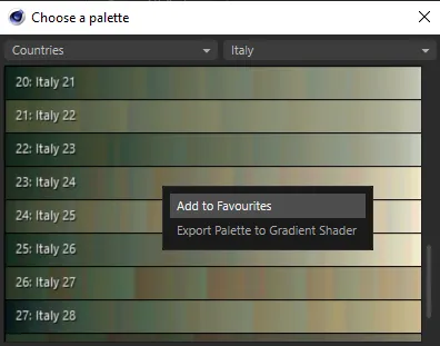
Add any palette to your favorites.
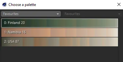
Palettes in the Favorites category.
Copyright © 2026 INSYDIUM LTD. All rights reserved.